APNSoft Controls [4.5.2.20]
Menu > Component Parts

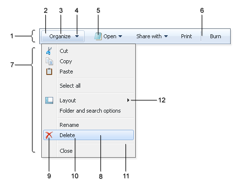
- Main Menu.
Can be horizontal or vertical (the APNSoftMenu.Orientation property). Customized via .MainMenuDIV{} class in the Skin's CSS Style.
- Main Menu: Item.
Presented by the item node in the XML Structure. Customized via Skin's CSS Style classes:
.MainMenuItemTD{}
.MainMenuItemHoveredTD{}
.MainMenuItemSelectedTD{}
- Main Menu: Item's Text.
Presented by the title node attribute in the XML Structure. Customized via .TitleTD{} class in the Skin's CSS Style.
- Main Menu: Arrow to submenu.
Specified by the images in the Skin Folder:
ArrowDown.gif
ArrowDownActive.gif
Or (if the APNSoftMenu.ExpandDirectionVertical="Upwards"):
ArrowUp.gif
ArrowUpActive.gif
- Main Menu: Item's Icon.
Presented by the icon and iconOver node attributes in the XML Structure. The images must be located in the Skin Folder.
- Main Menu: Separator.
Presented by the separator node in the XML Structure. Customized via .SeparatorVerticalTD{} class in the Skin's CSS Style.
- Submenu.
Customized via .SubMenuDIV{} class in the Skin's CSS Style.
- Submenu: Item.
Presented by the item node in the XML Structure. Customized via Skin's CSS Style classes:
.SubMenuItemTD{}
.SubMenuItemHoveredTD{}
.SubMenuItemSelectedTD{}
- Submenu: Item's Icon.
Presented by the icon and iconOver node attributes in the XML Structure. The images must be located in the Skin Folder.
- Submenu: Item's Text.
Presented by the title node attribute in the XML Structure. Customized via .TitleTD{} class in the Skin's CSS Style.
- Submenu: Separator.
Presented by the separator node in the XML Structure. Customized via .SeparatorHorizontalTD{} class in the Skin's CSS Style.
- Submenu: Arrow to submenu.
Specified by the images in the Skin Folder:
ArrowRight.gif
ArrowRightActive.gif
