|
DataGrid
Controls Suite 4.5 |
 | Overview |
 | Features |
 | Reference Book |
 | Live Demos |
| | Populating with Data |
| | Columns |
| | Rows |
| | Appearance & Layout |
| | Behavior |
| | Bottom Bar |
| | Application scenarios |
| | | Master/Detail Grids |
| | | CheckBoxes |
| | | DropDowns |
| | | Images |
| |  | Update Panel |
|
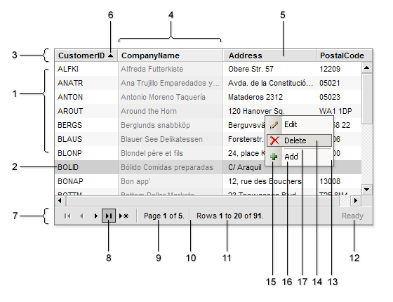
- The Rows collection.
Customized via Skin's CSS Style classes:
.RowsDIV{}
.RowsTABLE{}
- The Row.
Customized via Skin's CSS Style classes:
.RowEvenTR{}
.RowSelectedTR{}
.RowHoveredTR{}
- Grid's Header.
Customized via .HeaderDIV{} class in the Skin's CSS Style.
- The Column.
Customized via Skin's CSS Style classes:
.ColumnResizedDIV{}
.ColumnFixedDIV{}
- Header's Cell.
Customized via Skin's CSS Style classes:
.HeaderTD{}
.HeaderHoveredTD{}
The GridColumn.HeaderText property specifies the text displayed in the header section of the column.
- Sort Arrows.
Specified by the images in the Skin Folder:
SortArrowAsc.gif
SortArrowDesc.gif
- Bottom Bar.
Customized via Skin's CSS Style classes:
.BottomBarDIV{}
.BottomBarTABLE{}
The layout of elements on Bottom Bar is defined via template applied by using the GridBottomBar.Template property.
- Button on the Bottom Bar.
Presented by the Button node in the Bottom Bar's Template. Customized via Skin's CSS Style classes:
.BottomBarButtonTD{}
.BottomBarButtonHoveredTD{}
- Page number.
Presented by the Info node (and Data="Pages" node attribute) in the Bottom Bar's Template.
- Separator on the Bottom Bar.
Presented by the Separator node in the Bottom Bar's Template.
- The Rows info.
Presented by the Rows node (and Data="Rows" node attribute) in the Bottom Bar's Template.
- Status Bar.
Presented by the StatusBar node in the Bottom Bar's Template.
- Context Menu.
Use the ContextMenuHeader.Template property to specify the template for column headers or ContextMenuRow.Template property to specify the template for rows. Customized via .ContextMenuDIV{} class in the Skin's CSS Style.
- Item in Context Menu.
Presented by the item node in the Context Menu Template. Customized via Skin's CSS Style classes:
.ContextMenuItemTD{}
.ContextMenuItemHoveredTD{}
- Icon of Item in Context Menu.
Presented by the icon node attribute in the Context Menu Template.
- Text of Item in Context Menu.
Presented by the title node attribute in the Context Menu Template.
- Separator in Context Menu.
Presented by the separator node in the Context Menu Template. Customized via .ContextMenuSeparatorTD{} class in the Skin's CSS Style.
|